Understanding flexbox with tailwindcss
Flexbox treats items as a unidimensional list.
Container properties
direction
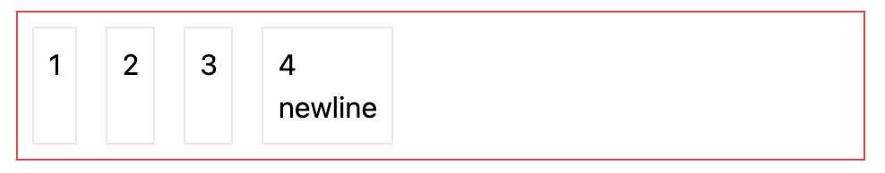
.flex.border.border-red-500
  .border.p-2.m-2 1
  .border.p-2.m-2 2
  .border.p-2.m-2 3
  .border.p-2.m-2
    4
    %br
    newline
Items are placed following a direction. Available directions:
flex-row(default)flex-row-reverseflex-colflex-col-reverse
.flex.border.border-red-500.flex-col
  .border.p-2.m-2 1
  .border.p-2.m-2 2
  .border.p-2.m-2 3
  .border.p-2.m-2
    4
    %br
    newline
wrapping
Items will be in the same line, with no wrapping. To have them wrap you should add one of:
flex-wrapflex-wrap-reverse
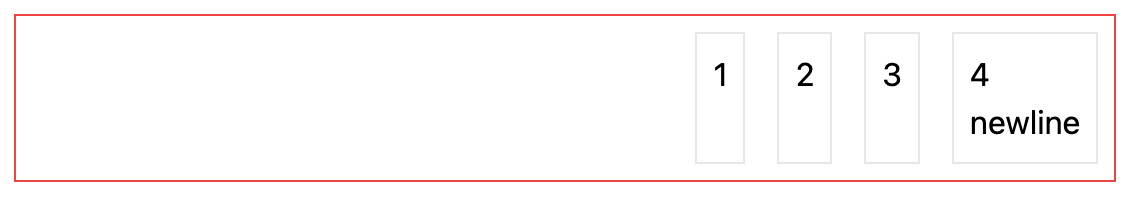
justify-content
The arrangement of items along the axis can be set with:
justify-startjustify-endjustify-centerjustify-betweenjustify-aroundjustify-evenly
These will not stretch or shrink the items.
.flex.border.border-red-500.justify-end
  .border.p-2.m-2 1
  .border.p-2.m-2 2
  .border.p-2.m-2 3
  .border.p-2.m-2
    4
    %br
    newline
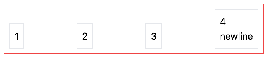
align-items
By default the items are stretched along the cross axis. You can change the alignment with
items-stretch(default)items-startitems-enditems-centeritems-baseline
.flex.border.border-red-500.justify-between.items-end
  .border.p-2.m-2 1
  .border.p-2.m-2 2
  .border.p-2.m-2 3
  .border.p-2.m-2
    4
    %br
    newline
align-content
Similar to justify-content, but relative to the cross axis. Options:
content-centercontent-startcontent-endcontent-betweencontent-aroundcontent-evenly
Children properties
order
order-1order-2- ..
order-firstorder-lastorder-none
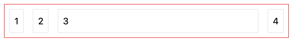
flex-grow
flex-grow-0flex-grow
.flex.border.border-red-500.justify-between.items-end
  .border.p-2.m-2 1
  .border.p-2.m-2 2
  .border.p-2.m-2.flex-grow 3
  .border.p-2.m-2 4
flex-shrink
flex-shrinkflex-shrink-0
flex-basis
Default size of an element before the available space is redistributed.
flex
Shortcut that combines grow, shrink and basis. Its usage is recommended
flex-1will grow and shrink as needed, ignoring its initial sizeflex-autowill grow and shrink, taking into account its initial sizeflex-initialwon’t grow, but will shrink if neededflex-nonewon’t grow or shrink at all
align-self
Overrides the single element cross axis position.
self-autoself-startself-endself-centerself-stretch